10 Best Newsletter Signup Form Examples to Inspire Your Own

Email marketing is a must-have tool to connect with customers and promote your products or services. With an ROI of 3,800%, it’s undoubtedly more effective than any other marketing channel.
At the heart of any successful email marketing campaign is a well-designed email signup form. It allows you to collect website visitors’ email addresses and other relevant information.
If you haven’t optimized your signup forms, you’re missing out on a lot of opportunities to grow your audience and business.
Therefore, we’ll cover 10 of the best signup form examples to inspire your own and help you turn visitors into engaged newsletter subscribers.
What Is a Newsletter Signup Form?
A newsletter signup form is a form you place on a webpage to collect visitors’ details like name, phone number, and email address so you can add them to your email list. This is especially important if you’re planning to make a blog that would double as an e-commerce store.
Once users join your subscriber list, you can send regular updates, promotions, and other helpful content to build solid relationships with them.
The good thing about email signup forms is that you engage subscribers with their consent, which results in high open and conversion rates.
Signup forms come in many shapes and sizes. For example, a simple signup form consists of form fields like first name and email address. In contrast, more complex responsive forms often contain interactive elements such as videos and gamification to increase the number of email signups.
Characteristics of High-Converting Newsletter Signup Forms
A high-converting signup form offers visitors immediate value by providing an incentive for signing up, like free stuff or a coupon code. An analysis by OptiMonk found that email popups without an incentive had an average conversion rate of 5.10%. Meanwhile, if you offered an ebook as an incentive for signing up, the conversion rate would rise to 7.49%, while providing a discount would make conversions go up to 7.65%.
Here are more features of an attractive signup form:
- The form matches the design and content of the signup page;
- It’s simple, with a maximum of one or two fields;
- It has a clear call to action (CTA) button that stands out.
10 Best Signup Form Examples
Now, let’s look at 10 of the best signup form examples to inspire you to create forms that drive high conversions:
1. Recess
The design and copy are the most crucial elements in signup forms. But the signup form example from Recess favors the design over the copy:
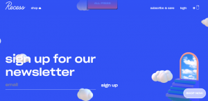
Image source: Recess
The email signup form is at the bottom of the Recess’ homepage and fits in perfectly with the brand’s aesthetics. For reference, the homepage is beautifully designed with lively colors and a unique font.
Overall, the signup form is consistent with the brand’s identity and blends perfectly with its surrounding elements.
2. Nerd Fitness
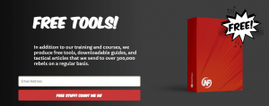
Image source: Nerd Fitness
The signup form from Nerd Fitness is an excellent example of a form that converts well since it fits the overall theme of the brand.
The form is straightforward, with only one input field and also offers giveaways in the form of free tools, downloadable guides, and tactical articles. The informal language in the signup form’s copy and the playful CTA button make the signup process fun.
The email capture form also shows social proof, with over 300,000 people already signed up, which can improve conversions.
3. Georg Jensen Damask
After you spend a few seconds on Georg Jensen Damask’s homepage, the signup form below slides in:
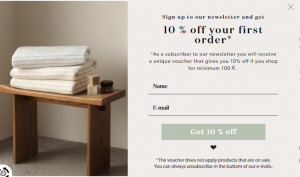
Image source: Georg Jensen Damask
The form’s design, color scheme, and fonts perfectly match the website. The 10% off your first order incentive is also attractive to subscribers.
Rather than stuffing its signup form with long marketing consent and legal formalities, the brand discloses that “the voucher does not apply to products that are on sale.”
That helps it pass its message and collect visitors’ information without diverting attention from the original goal of signing up.
4. Primal Pet Foods
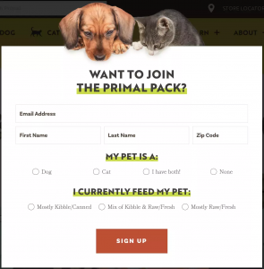
Image source: Primal Pet Foods
Most signup forms are usually pretty generic. But the Primal Pet Foods signup form is one of the most creative on this list — with a dog and a cat observing the registration process.
Also, the form asks for more information than other forms on our list. Besides the email address, Primal Pet Foods asks for the user’s name, zip code, and pet-related details.
Although the signup form seems to have a lot of input fields, it uses the different UI components cleverly. For instance, you can answer the two pet-related questions by selecting an option rather than writing an entire text.
With such info, the brand can segment its users easily when they sign up and target them with personalized emails.
5. Poketo
Next on our list is Poketo, a business that sells houseware, stationery, and other accessories. The brand uses a floating bar that pops up when you stay on the website for a few seconds.
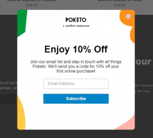
Image source: Poketo
It blends with the rest of the website’s aesthetics, following the same brand guidelines (color, font, and design). In addition, the ‘Enjoy 10% off’ incentive is easy to spot and hard to overlook.
6. Highway Robery
Image source: Highway Robery
“Sign up for news and notes from around the robe.”
There’s no error in that sentence. Highway Robery’s playful personality shines through in this newsletter signup form example. Since the brand sells robes, it found a creative way to attract customers’ attention with its copy.
The signup form design is simple. It has one form field, engaging text, and a contrasting CTA button. Since the form lacks images, the eye-catching copy is the main attention-grabber.
7. Revelry
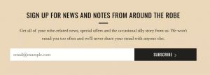
Image source: Revelry
Revelry designs elegant boho dresses for bridesmaids and gives away a $200 gift card to one subscriber every month, which is a fantastic incentive.
As a result, prospects can enter the competition and claim a wonderful gift by signing up. And given how expensive these dresses are, the incentive can drive a lot of conversions.
In addition, the signup form asks if the website visitor is a bride, bridesmaid, or another person, which makes segmentation much easier for the brand.
The subscription form also has an image that shows a bridesmaid in a stunning dress to attract its target audience much faster.
8. The Mrs. Book
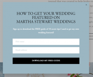
Image source: The Mrs. Book
In this signup form example, the brand uses a clean and straightforward design, avoiding unnecessary distractions to focus solely on the primary call to action — downloading the free guide.
For example, the “Sign up to download the FREE guide” section offers a clear incentive for the visitor. It also emphasizes the word “FREE” to appeal to those looking for free stuff. In addition, the text “10 secret tips I used to get my own wedding featured!” provides a clear value proposition, giving users a specific reason to download the guide.
9. RockMerch
RockMerch is an ecommerce store that sells vinyl records, pop culture merchandise, official band merchandise, and rock band-themed accessories and apparel.
Its spin-to-win popup form below is a great example of how to keep things simple and interesting.
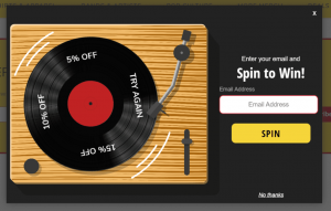
Image source: RockMerch
Unlike a standard promotional offer, the “spin to win” concept adds a gamified element to the user experience, making it fun and engaging.
The first thing that stands out about this form is the vinyl record design that resonates with its key target audience — music lovers. In addition, the different segments on the vinyl record showcase the potential rewards, such as “5% OFF” and “10% OFF,” helping users understand what they can gain.
The form also uses bright yellow and red against a darker background, making the call-to-action elements, like the “SPIN” button and “Enter your email” prompt, highly noticeable.
10. Death Wish Coffee
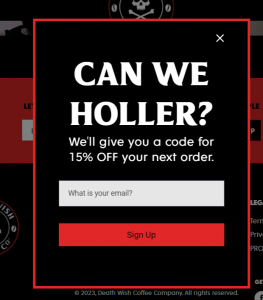
Image source: Death Wish Coffee
Death Wish Coffee offers both value for customers and creativity in this signup form example.
The question “CAN WE HOLLER?” quickly captures the visitor’s attention. If the user answers “yes,” then they just read the sentence below and know they’ll get a 15% discount when they sign up.
Plus, there’s only one field to fill out, which makes it pretty simple to get the discount.
In addition, the black background with bold white text and a vibrant red call-to-action button creates a strong visual contrast, capturing the visitor’s attention instantly.
Key Takeaways
There you have it. A well-designed newsletter signup form will help you improve your email marketing campaign. All the signup forms we’ve showcased illustrate how different designs, messaging, and offers can influence the effectiveness of your signup pages.
In summary, a great signup form:
- Offers an incentive that helps with conversion (coupons and discounts);
- Is simple, with a maximum of one or two fields;
- Has a clear CTA button that stands out.
The right affordable email marketing tool will help you create effective newsletter signup forms. A good tool offers affordable pricing, segmentation, personalization, ease of use, and a unified structure that eliminates the need for separate tools for forms, popups, and email.
